
在這之前,已經沒有要拜讀的東西了,不過有幾點明確認知請大家注意:
在這之前,已經沒有要拜讀的東西了,不過有幾點明確認知請大家注意:
- IE6+7 sucks!
- 本文作者是三尛咖!
- 本文秉持著"先研究不傷眼睛,再講究效果"
- 若有不適者請勿繼續閱讀(疑?)。
- update, 請愛用 DTD。
到了這般地步,我想應該已經沒有甚麼特殊技能了。畢竟 CSS Styling 所需要的其實不是鑽研它能做些甚麼,而是你必須要知道你想要做些甚麼,而 CSS Styling 能否能滿足你的需求,如此而已。所以,也別把 CSS 當作仙丹妙藥,在對所謂的樣板、版面的製作與調整中,你必須得考量的是哪一種方式對你來說才是最適切的方式,如果不能避開那些要害,那最起碼做到兩害(CSS Styling 或是 HTML Coding)取其輕。
無論你最後決定採取的方式是什麼,身為一個樣板、版面的製作者,總不能設(design)後不理,搞到最後還得勞師動眾(視覺這種事情可沒有 RTFM 這回事),弄得自己裡外不是人(編按:可以做人幹嘛做設計(寫程式))。這是比較常見的問題,視覺設計(ART)與程式人員之間永遠也切不斷的問題。
- CSS 到底誰要做?
- 樣板一套程式,視覺就炸開了?
- ART 一改樣板,程式就爛掉了?
- 以下 Loop...
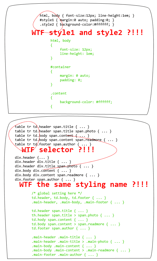
所以(敲黑板),老師在講你都沒有在聽(丟筆)!跟你說要用 CSS,用 CSS,用 CSS,你用了沒?沒有嘛!所以你的樣板會炸開,所以你的程式會爛掉,**有套 CSS 讓你上天堂,沒套 CSS 讓你哭斷腸!**老師在講你都沒有在聽嘛(以下 Loop...)。請思考一個問題,甚麼樣的 CSS Styling 才算是一個好的 CSS Styling?
- 優先且強制定義常用樣式。
- 相信瀏覽器,不要相信所見即所得。
- 清楚定義樣式名稱。
- 了解樣式從屬關係。
- 考慮例外(通常由 IE6+7 sucks! 造成)。
我再說一次,這不是仙丹妙藥,也不是需要奉為圭臬的什麼法則,這裡只有粗淺的經驗談(請大聲朗誦:本文作者是三尛咖!)。在我們考慮將一個視覺設計轉移到瀏覽器上去實現時,除了你需要具備的一些經驗之外(請參閱 第一篇、第二篇),剩下的其實只有你對於 CSS 的熟悉程度,還有你自己如何去規畫 CSS Styling 的習慣。什麼是習慣?我們看圖說故事會比較清楚明瞭一點。
無論你是使用甚麼樣的軟體來撰寫或是設定你的樣式,請務必確認你自己知道自己在做些甚麼事情!無論你的樣板有多複雜,請讓他保持很清楚明瞭的 DOM 樹狀結構,同樣的,也請你將你的 CSS 設定檔案保持很清楚明瞭的設定結構。無論現在的編輯軟體再怎麼聰明(就連最常見的 Dreamweaver),都會有看不懂 DOM 結構的時候,特別是當你自己都不知道問題出在哪裡的時候。
要整合你的 CSS Styling,其實從最根本的地方一步一步來,你就能抓出屬於自己的 Styling 風格!
- 已經很清楚樣板區塊。
- 針對所有樣板區塊進行樣式設定。
- 重新檢查樣式,剃除不需要的選擇器。
- 重新檢查樣式,善用選擇器合併功能相同的樣式,善用 CSS 屬性繼承。
- 重新檢查樣式,刪除重複的樣式,並將這些樣式往父元件回朔,全部寫入父元件樣式設定中。
- 重新檢查樣式,確認所有的樣式屬性不會因為繼承關係將頁面搞炸。
- 不同的頁面用 @import 匯入,將 CSS 拆開成數個檔案。
- 有一支大家用的叫做 base.css,個別頁面用的叫做 home.css... 依此類推。
- IE6+7 sucks!請額外準備 IE6+7 用的 CSS 檔案。
以上,提供給各位做參考!接下來,沒有說明,沒有翻譯,沒有解釋,沒有閃光,沒有美女圖,只有一些暴力範例畫面,給各位先進們參考一下。注意,由於內含了 jQuery 的粗淺應用(請大聲朗誦:本文作者是三尛咖!),所以萬一 jQuery 寫得很醜很難看,請各位先進們笑的時候小聲一點,不要吵到上班的同事就可以了。以下我從 IE6+7 sucks!開始,大概有這幾個項目:
- CSS Styling in IE6+7
- Float Menu
- Position with multi-background
- Clear & beautiful list item
- Powerful slice table
- Beautiful form
- Smart readme & tips
我們先來講第一項。現行扣除掉 IE8 以外,IE6+7 有多不合群應該已經是眾所皆知,好險 IE 為了凸顯自己在 HTML 上的強大(?),推出了叫做條件式註解的東西,想當然爾,這鬼東西當然只有 IE 會支援。所以說,這個東西就被拿來當作是專門要給 IE 使用的 CSS 檔案所放置的地方了。至於,什麼是條件式註解,怎麼用,關於這一點請去問問 Google 大神,不要來問我喔(搖手)。
以下是範例:
	    <!-- IE6 或以前的版本會執行這個部分 -->
	    <link rel="stylesheet" type="text/css" href="./styles/base.ie6.css" />
	<![endif]-->
	<!--[if IE 7]>
	    <!-- IE7 會執行這個部分 -->
	    <link rel="stylesheet" type="text/css" href="./styles/base.ie7.css" />
	<![endif]-->
接著,我們來看看浮動選單。其實,這種範例網路上有一大堆,浮動選單的重點其實跟 CSS 可能比較沒關係(驚!),不過,我們撇開 Javascript 不談(這是工程師的問題),一個浮動選單在製作與輸出時,我們該怎麼做會比較好?對於簡單的選單來說,我們第一個應該會想到清單元件(如果你還是想到 Table,那麼請砍掉重練)。然而,怎麼樣讓清單元件能夠浮動,這又是工程師的問題了!雖然每一個工程師的習慣不同,但是簡單清楚的清單結構,絕對是相得益彰!
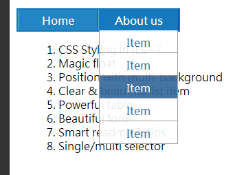
<ul id="ul-button">
    <li class="item"><a href="">Home</a>
        <ul class="list-menu">
            <li class="list-item"><a href="">Item</a></li>
            <li class="list-item"><a href="">Item</a></li>
            <li class="list-item"><a href="">Item</a></li>
            <li class="list-item"><a href="">Item</a></li>
            <li class="list-item"><a href="">Item</a></li>
        </ul>
    </li>
    <li class="item"><a href="">About us</a>
        <ul class="list-menu">
            <li class="list-item"><a href="">Item</a></li>
            <li class="list-item"><a href="">Item</a></li>
            <li class="list-item"><a href="">Item</a></li>
            <li class="list-item"><a href="">Item</a></li>
            <li class="list-item"><a href="">Item</a></li>
        </ul>
    </li>
</ul>
	#ul-button {
	    border: 2px solid #1579bc;
	    background-color: #2385c3;
	    width: 234px;
	    height: 30px;
	    list-style: none;
	    margin: 0;
	    padding: 0;
	}
	#ul-button > li {
	    color: #fff;
	    font-weight: bold;
	    width: 115px;
	    height: 24px;
	    float: left;
	    text-align: center;
	    padding-top: 6px;
	    cursor: pointer;
	    background-color: transparent;
	}
	#ul-button > li:hover {
	    background-color: #1579bc;
	}
	#ul-button > li.item {
	    border-right: 1px solid #005d96;
	    border-left: 1px solid #74b4bc;
	}
	#ul-button li a {

	}
	#ul-button li a:hover {
	    text-decoration: none;
	}
	.list-menu {
	    width: auto;
	    height: auto;
	    list-style: none;
	    margin: 0;
	    padding: 0;
	    position: relative;
	    top: 0px;
	    left: 0px;
	    z-index: 10000;
	    display: none;
	    filter: alpha(opacity=90);
	    -moz-opacity: 0.9;

	    border-left: 1px solid #999;
	    border-right: 1px solid #999;
	}
	.list-menu li:first-child {
	    margin-top: 3px;
	}
	.list-menu > .list-item {
	    padding-top: 8px;
	    color: #369;
	    background-color: #ffffff;
	    border-bottom: 1px solid #999;
	    height: 24px;
	}
	.list-menu > .list-item:hover {
	    background-color: #369;
	    color: #fff;
	}

	.list-menu {
	    width: auto;
	    height: auto;
	    list-style: none;
	    margin: 0;
	    padding: 0;
	    position: relative; /* 利用定位屬性改變他的位置 */
	    top: 0px;
	    left: 0px;
	    z-index: 10000; /* 利用深度屬性改變他的顯示深度 */
	    display: none;
	    filter: alpha(opacity=90);
	    -moz-opacity: 0.9;

	    border-left: 1px solid #999;
	    border-right: 1px solid #999;
	}
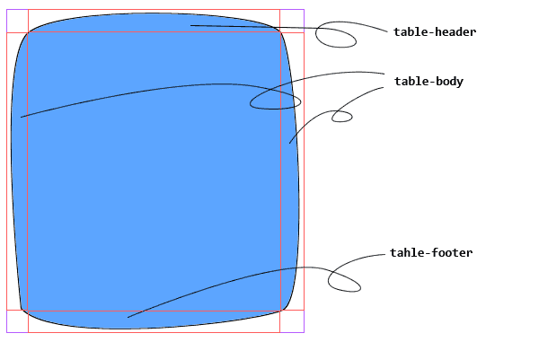
接著,我們來看看較為複雜的背景設定(第一篇 其實就是一個例子),但是,複雜背景設定除了考驗了你對於 Box 元件的掌握度,其實也考驗著你對於版型切割的經驗與設計習慣。
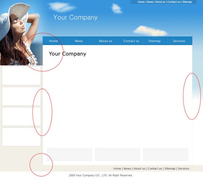
我就近舉個例子,我的部落格就是用了三種背景的設定。
其實這種設計模式,可能在一般較為正式的場合並不常見,畢竟這樣破格的設定不是每個人都會喜歡。但是,並非只有在這種狀況下會特別對元件動手腳,而是當你遇上了某一些有動態背景、動態元素的時候,這樣的設定就能帶來一定的便利與可利用性。我們簡單的來看這樣的背景元件視圖:
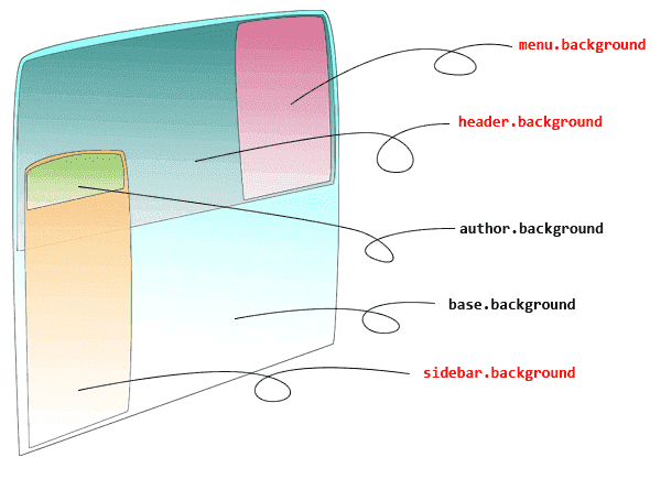
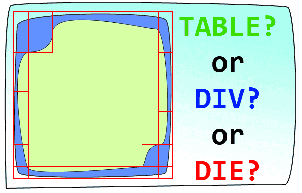
其中,重點在於三個紅色的地方。這樣的背景設定是絕對無法使用 Table 來取代的(覺得我是唬爛的人請自行嘗試),所以,我們就必須仰賴 Box 元件的浮動(float)與定位(position)來達成我們想要的結果。在做這種特殊的版型時,由於 IE6+7 sucks!的關係,所以我們一樣,必須要考慮三種情況:
	body {
	    font:12px "微軟正黑體", "Malgun Gothic", "Meiryo", "Segoe UI", "Trebuchet MS", "MS PGothic", "Gulim", "AppleGothic", "Sans-serif";
	    color:#666;
	    background: url(images/bg.jpg) left top repeat #303030;
	    padding:0;
	    margin:0;
	}
	#header_container {
	    width: 1000px;
	    height: 395px;
	    padding: 0;
	    border-bottom: 10px solid #666;
	    background-color: #333;
	}
	#header {
	    font: 0.75em/1.0em "Sans-serif";
	    width: 800px;
	    height: 12px;
	    color: #cdcdcd;
	    margin: 0;
	    padding: 6px 200px 0px 0px;
	    text-align: right;
	    border-bottom: 1px solid #666;
	}
	#flickr_album {
	    float: left;
	    width: 750px;
	    height: 375px;
	    border-right: 1px solid #666;
	}
	#header_menu {
	    float: left;
	    width: 244px;
	    height: 355px;
	    padding: 10px 0px 10px 5px;
	    background: url(./images/sideBlogMenuBg.jpg) top left repeat-x #303030;
	    text-align: right;
	    color: #fff;
	}
	#header_cross_sidebar {
	    width: 200px;
	    height: auto;
	    float: left;
	    margin: -220px 0px 0px 0px;
	    padding: 0;
	    background-color: #fff;
	}
	#content_container {
	    clear: right;
	    float: left;
	    width: 775px;
	    height: auto;
	    padding: 10px 5px 20px 10px;
	    background-color: #fff;
	}
	/* hack for IE6+ */
	#header_cross_sidebar {
	    margin: -200px 0px 0px -320px;
	}
	#content_container {
	    margin-left: -120px;
	}
	/* hack for IE7 */
	#header_cross_sidebar {
	    margin: -200px 0px 0px -320px;
	}
	#content_container {
	    margin-left: -120px;
	}
header_cross_sidebar { margin: -220px 0px 0px 0px; }
你沒眼花,重點只有這一段設定。它的意思是,我的上邊留白要往負的方向走(廢話)。這種設定在某些情況下是很危險的,因為你很有可能一不小心就變成這個樣子了:
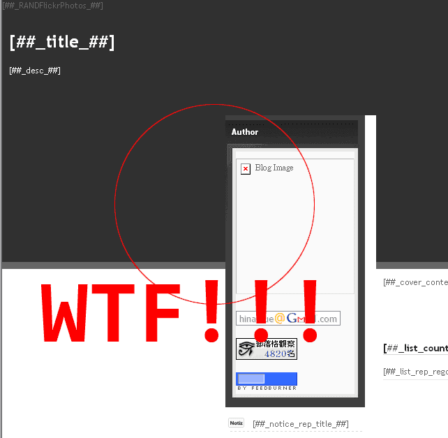
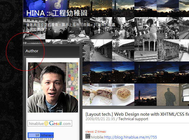
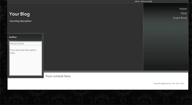
所以,對於浮動與定位元件的使用,請戒慎恐懼多用點心,畢竟現在的瀏覽器,所見即所得只是假象而以!這個簡單的樣板最後會是這個樣子:
再來,我們來看個漂亮詭異的清單元件。
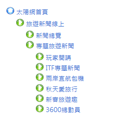
我記得 上一篇 有提過,作清單元件不一定要使用清單標籤,但是,使用清單標籤的好處是,我不需要下太多複雜的 CSS 語法,畢竟,我們最終的目的,只是要條列而已,並不是要做出什麼很炫的特效。那麼,扣掉原本預設的項目之外,我們還可以利用背景設定來做到特殊的清單元素。不過,尚須留意的是,背景元素固然方便好用,但是由於字體有大小、行高的設定,而背景可沒有這種關聯性,所以,清單元件要碼就比字體小,要碼就一樣大,不然清單排起來會很詭異。
	.sitemap-parent ul {
	    list-style-type: none;
	    margin: 0;
	    padding: 0;
	}
	ul.sitemap-parent li {
	    background: url(../images/agt_forward_right.png) left top no-repeat transparent;
	    padding: 0.2em 0 0.2em 20px;
	}
	ul.sitemap-parent li.parent {
	    background: url(../images/agt_home.png) left top no-repeat transparent;
	}
	ul.sitemap-parent li.empty {
	    background-image: none;
	}
	ul.sitemap-parent li ul li {
	    padding: 0.2em 0 0.2em 20px;
	}
	ul.sitemap-parent li ul li ul li {
	    padding: 0.2em 0 0.2em 20px;
	}
當然,小範圍內的不同的設定,可以使用子元件選擇器。
接著,來看看表格。
這樣的情況非常常見,當我們需要一個規則(或是不規則)的 Box 元件時,我們就可能會這麼做。當然,上述的例子是最簡單,也最顯而易見的一種。除了 Table 之外,我們還有什麼選擇?我想大家應該會想到幾個標籤可以這麼做的:<table><tr><td>, <div>, <ul><li>, <dl><dt><dd> 當然,你覺得哪一種最合適就用哪一種。通常在切割這種需要特殊底圖的 Box 元件時,盡量都以簡化為主,如果能夠固定寬度,那麼我們就切成三個部分(上、中、下),如果高度鎖定,那麼我們就切成左、中、右三個部分,如果都不固定,那就恭喜了,必須得像上圖一樣,切成九宮格,總共九個區塊。怎麼切最聰明,怎麼切最快,怎麼切問題會最少?
通常,我會這麼做:
<ul id="powerful-table">
    <li class="box-lt">1</li><li class="box-ct">2</li><li class="box-rt">3</li><li class="box-lm">4</li>
    <li class="box-cm">5</li>
    <li class="box-rm">6</li><li class="box-lb">7</li><li class="box-cb">8</li><li class="box-rb">9</li>
</ul>
	#powerful-table {
	    list-style: none;
	    margin: 0;
	    padding: 0;
	    border: 0;
	    width: auto;
	    height: auto;
	}
	#powerful-table li {
	    margin:0;
	    padding:0;
	    float: left;
	    height: 10px;
	    width: 10px;
	    line-height: 10px;
	    /* font-size: 9px; */
	}
	#powerful-table > li.box-lm,
	#powerful-table > li.box-lb {
	    clear: left;
	}
	#powerful-table > li.box-lt {
	    background: url(./images/left-top.gif) top left no-repeat transparent;
	}
	#powerful-table > li.box-ct {
	    width: auto;
	    background: url(./images/center-top.gif) top left repeat-x transparent;
	}
	#powerful-table > li.box-rt {
	    background: url(./images/right-top.gif) top right no-repeat transparent;
	}
	#powerful-table > li.box-lm {
	    height: auto;
	    background: url(./images/left-middle.gif) top left repeat-y transparent;
	}
	#powerful-table > li.box-cm {
	    width: auto;
	    height: auto;
	    background: url(./images/center-middle.gif) top left repeat transparent;
	}
	#powerful-table > li.box-rm {
	    height: auto;
	    background: url(./images/right-middle.gif) top right repeat-y transparent;
	}
	#powerful-table > li.box-lb {
	    background: url(./images/left-bottom.gif) bottom left no-repeat transparent;
	}
	#powerful-table > li.box-cb {
	    width: auto;
	    background: url(./images/center-bottom.gif) bottom left repeat-x transparent;
	}
	#powerful-table > li.box-rb {
	    background: url(./images/right-bottom.gif) bottom right no-repeat transparent;
	}
這樣模擬表格的方式,其實還有另外一個好處,那就是不會受限於單純表格的行、列必須要等寬或是等高的限制(這也就是為什麼繪圖軟體切圖時,會留下一些 1px 的圖片欄位)。當然,如果遇上了更多更複雜的特殊底圖的 Box 元件,那麼我想這樣的切法帶來的可調整性與便利性應該會更顯而易見,但,相對的,HTML Code 很有可能就因此而爛掉了(有一好沒有兩好)。但是,這種情況下,總比切了一大堆巢狀的 Table 要來得好很多。
接著我們來聊聊表單元件。在開始之前,我們先來看一個很標準的表單。
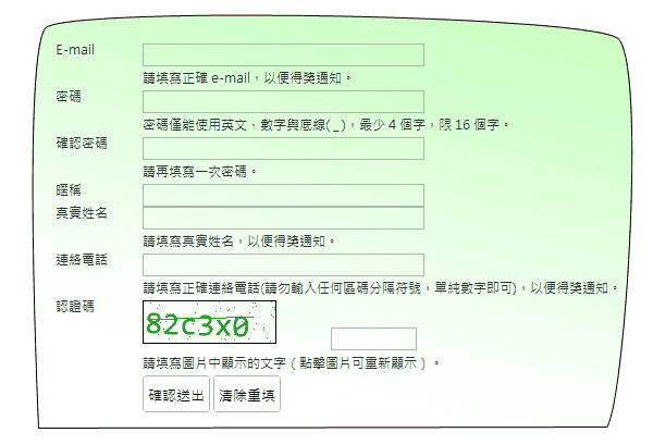
通常這樣的表單元件,一般來說,照常理來說,最常見的方式是,用 Table 畫最萬無一失。
<!-- 但是由於本人秉持先研究不傷身體,所以所有 Table 原始碼都會自動屏蔽 -->
但是,我常常聽到 ART 說:文字與輸入框不能對齊、選項跟文字放同一列會歪掉、OO 跟 XX 放在列(行)中無法對齊,諸如此類的。所以,我這裡當然不會跟你說要怎麼用表格畫出表單元件(只要會用 Word 的人都會,那還需要 ART 做啥),我的類表單元件從來不用 TABLEs 畫(認真)。
<dl id="beautiful-form">
<dt>E-mail</dt><dd><input type="text" name="email" id="email" value="" size="40" maxlength="100" /></dd>
<dt> </dt><dd>請填寫正確 e-mail,以便得獎通知。</dd>
<dt>密碼</dt><dd><input type="password" name="password" id="password" value="" size="40" maxlength="16" /></dd>
<dt> </dt><dd>密碼僅能使用英文、數字與底線( _ ),最少 4 個字,限 16 個字。</dd>
<dt>確認密碼</dt><dd><input type="password" name="confirm" id="confirm" value="" size="40" maxlength="16" /></dd>
<dt> </dt><dd>請再填寫一次密碼。</dd>
<dt>暱稱</dt><dd><input type="text" name="nickname" id="nickname" value="" size="40" maxlength="100" /></dd>
<dt> </dt><dd>請填寫暱稱。</dd>
<dt>真實姓名</dt><dd><input type="text" name="username" id="username" value="" size="40" maxlength="100" /></dd>
<dt> </dt><dd>請填寫真實姓名,以便得獎通知。</dd>
<dt>連絡電話</dt><dd><input type="text" name="mobile" id="mobile" value="" size="40" maxlength="100" /></dd>
<dt> </dt><dd>請填寫正確連絡電話(請勿輸入任何區碼分隔符號,單純數字即可),以便得獎通知。</dd>
</dl>
	#beautiful-form {
	    margin:0;
	    padding:0;
	    width: auto;
	    height: auto;
	}
	#beautiful-form dt {
	    width: 80px;
	    float: left;
	}
	#beautiful-form dd {
	    float: left;
	}
	#beautiful-form dd + dt {
	    clear: left;
	}
接著,我們繼續來看表單元件中常使用到的勾選、輸入框。
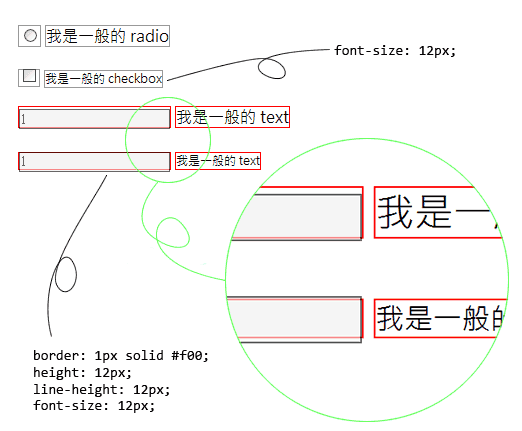
我想這是一般在使用輸入框時,很容易產生的一個問題。特別是 <input> 這個標籤並不屬於 Box 元件,所以你要將它對齊就比較困難,當然,如果你是 Table 愛用者,我想對齊這些元件可能不是什麼難事。不過,由於 Table 看多了有礙身心健康,所以我們這邊會介紹的當然是非 Table 所能做到的事情。<input> 元件其實與一般的文字元件差異並不大,你可以把它想成:
INPUT = #TEXT + @CSS{ padding: 1px 0px 2px 1px; } + @CSS{ border: 1px solid #000; }
這樣有比較容易理解嗎?上面的那張圖片,字比較大的,是使用瀏覽器,也就是使用者端的預設 1em 的字體大小,字比較小的,則是使用 CSS 設定尺寸為 12px 的大小。紅色框框的部分,是使用 SPAN 標籤包起來的部分,灰色的部分就是原本的輸入框,而右邊則是跟在輸入框旁邊的文字。這個時候你會發現,一般的文字會很乖的讓 SPAN 給包起來,而 <input> 則會到處亂跑。
如果要讓表單看起來很整齊,多數時候我們會使用 <ul><li> 標籤來做到。
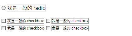
至於那個 <input> 亂跑的狀況怎麼辦?這裡提供一個 CSS 給各位參考:
	.checkbox-item {
	    display: block;
	    margin: 5px 0px 5px;
	}
最後,來說說 content 這個有趣的屬性。先給個範例:
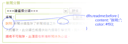
搭配著 CSS 的擬似元素(pseudo-elements)中的 :before 與 :after 使用的 content 屬性,可以在元素的前面或是後面加入一些文字或是加入 counter 屬性(請參考 上一篇)。這兩種擬似元素在一些內文或是表單說明的地方非常的好用,若是搭配著 counter 屬性,則可以做到在內文中使用附註(編號)的效果。
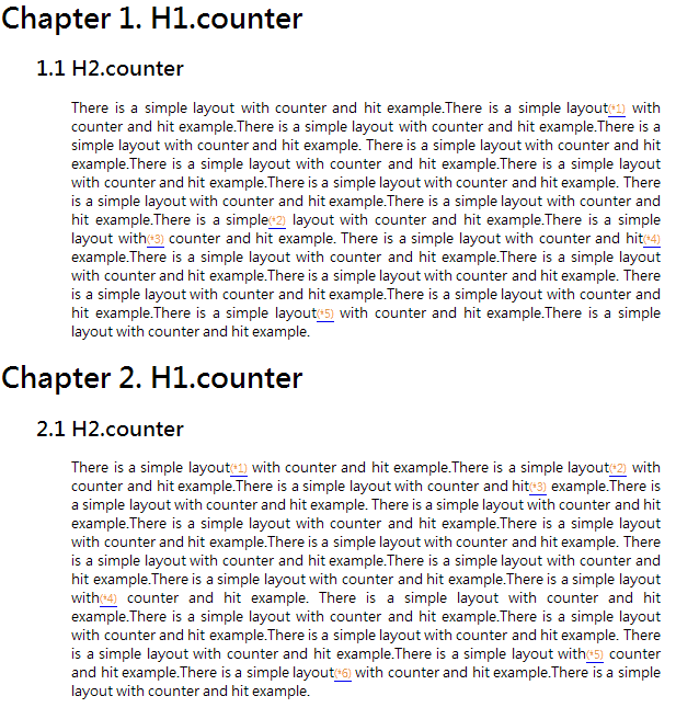
	<!DOCTYPE html PUBLIC "-//W3C//DTD XHTML 1.1//EN" "http://www.w3.org/TR/xhtml11/DTD/xhtml11.dtd">
	<html xmlns="http://www.w3.org/1999/xhtml" xml:lang="zh-TW">
	<head profile="http://gmpg.org/xfn/11">
	<meta http-equiv="content-Type" content="text/html; charset=UTF-8" />
	<title>Simple Layout - counter</title>
	<style type="text/css">
	<!--
	body {
	    counter-reset: chapter;
	}
	h1:before {
	    content: "Chapter " counter(chapter) ". ";
	    counter-increment: chapter;
	}
	h1 {
	    counter-reset: section;
	}
	h2:before {
	    content: counter(chapter) "." counter(section) " ";
	    counter-increment: section;
	    margin-left: 40px;
	}
	div.content {
	    counter-reset: hotpoint;
	    margin: 0px 20px 0px 80px;
	    text-align: justify;
	}
	div.content a.hotpoint:after {
	    content: "(*" counter(hotpoint) ")";
	    counter-increment: hotpoint;
	    color: #f93;
	    font-size: 0.82em;
	}
	-->
	</style>
	</head>
	<body>
	<h1>H1.counter</h1>
	    <h2>H2.counter</h2>
	    <div class="content">
	        There is a simple layout with counter and hit example.There is a simple layout<a href=#" class="hotpoint"></a> with counter and hit example.There is a simple layout with counter and hit example.There is a simple layout with counter and hit example.
	        There is a simple layout with counter and hit example.There is a simple layout with counter and hit example.There is a simple layout with counter and hit example.There is a simple layout with counter and hit example.
	        There is a simple layout with counter and hit example.There is a simple layout with counter and hit example.There is a simple<a href=#" class="hotpoint"></a> layout with counter and hit example.There is a simple layout with<a href=#" class="hotpoint"></a> counter and hit example.
	        There is a simple layout with counter and hit<a href=#" class="hotpoint"></a> example.There is a simple layout with counter and hit example.There is a simple layout with counter and hit example.There is a simple layout with counter and hit example.
	        There is a simple layout with counter and hit example.There is a simple layout with counter and hit example.There is a simple layout<a href=#" class="hotpoint"></a> with counter and hit example.There is a simple layout with counter and hit example.
	    </div>
	<h1>H1.counter</h1>
	    <h2>H2.counter</h2>
	    <div class="content">
	        There is a simple layout<a href=#" class="hotpoint"></a> with counter and hit example.There is a simple layout<a href=#" class="hotpoint"></a> with counter and hit example.There is a simple layout with counter and hit<a href=#" class="hotpoint"></a> example.There is a simple layout with counter and hit example.
	        There is a simple layout with counter and hit example.There is a simple layout with counter and hit example.There is a simple layout with counter and hit example.There is a simple layout with counter and hit example.
	        There is a simple layout with counter and hit example.There is a simple layout with counter and hit example.There is a simple layout with counter and hit example.There is a simple layout with<a href=#" class="hotpoint"></a> counter and hit example.
	        There is a simple layout with counter and hit example.There is a simple layout with counter and hit example.There is a simple layout with counter and hit example.There is a simple layout with counter and hit example.
	        There is a simple layout with counter and hit example.There is a simple layout with<a href=#" class="hotpoint"></a> counter and hit example.There is a simple layout<a href=#" class="hotpoint"></a> with counter and hit example.There is a simple layout with counter and hit example.
	    </div>
	</body>
	</html>
到頭來,我根本沒提到 jQuery 嘛(眾毆
我到後來想了想,真的把 jQuery 拉進來,好像偏離 CSS 的主題偏太多了,而且穿插 jQuery 的話,應該會更難消化(謎之音:其實是因為你自己懶,不想寫進來吧)。不過,這裡大抵上也是一些 CSS 的應用,希望這些簡單的例子能帶給大家更多關於 CSS 的美好(沒有誤)。
最後(終於?),希望我不會再寫 part 5 了(疑?)。

![[CSS] Flex/Grid Layout Modules, part 16](/content/images/size/w960/2022/05/grid-sample-80-1.png)
![[CSS] Flex/Grid Layout Modules, part 15](/content/images/size/w960/2022/01/grid-sample-73-1.png)
![[CSS] Flex/Grid Layout Modules, part 14](/content/images/size/w960/2021/09/grid-sample-70-1.png)