> ## Content Index
> Fetch the complete content index at: https://blog.hinablue.me/llms.txt
> Use this file to discover other available public pages before exploring further.
# [12th 鐵人賽] Grid 格線系統 Part 1, Day 11
- URL: https://blog.hinablue.me/12th-ithome-ironman-day-11/
- Published: 2020-09-25T14:28:47.000Z
- Updated: 2026-07-06T18:40:24.000Z
- Author: Hina Chen
- Tags: CSS, ITHome, 鐵人賽, 2020, Grid Layout, Grid System, Media Query
## 概述
我們再重新複習一下,
> Grid for layout, Flex for component.
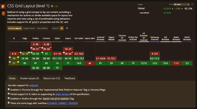
格線系統的發展從 2011 年開始,一直到 2016 年開始進入 CR 的階段。以目前的版本來看,市面上瀏覽器的 [支援程度](https://caniuse.com/?search=grid&ref=blog.hinablue.me) 看起來是相當樂觀的。
所以,到底 Grid 帶來了什麼東西?
- [CSS Grid Layout Module Level 2](https://www.w3.org/TR/css-grid-2/?ref=blog.hinablue.me) 如其名,他就是用來排版的。
- 一次設定兩個維度的流向。
- 兩個軸會構成一個區塊,無論你要不要,就是會有那個區塊。
- 對齊方式延續 Flex,還多了一些東西。
- 可以設定間距(*gap*)。
- 帶來更多(也更複雜)的屬性設定與值。
- 可同時參考 [Box Alignment Module Level 3](https://www.w3.org/TR/css-align-3/?ref=blog.hinablue.me), [Box Model Module Level 4](https://www.w3.org/TR/css-box-4/?ref=blog.hinablue.me) 與 [Fragmentation Module Level 4](https://www.w3.org/TR/css-break-4/?ref=blog.hinablue.me)。
如同 [Amos](https://csscoke.com/?ref=blog.hinablue.me) 所述,Grid 比較向是「點線面」當中的 **面**,是利用兩個相交軸構成一個平面。然後我們在這個平面區域當中做事情。而我個人比較喜歡稱 Grid 為 **Excel**。
> 對,就是大家熟悉的那個 Excel。
>
> 或者說,要說是新一代的 Table 排版也不是不行(欸)。
說明一下共通點(~~有人想知道 Grid 跟 Excel 的共通點嗎?~~
- 都是由 `column` 與 `row` 組成。
- 可以跨欄置中。
- 可以合併儲存格。
- 可以加框線。
- 每個 `column` 或 `row` 的尺寸會影像到同維度的所有元件。
- `4 x 4` 就是 `16`,沒在跟你五四三的。
- 交叉維度之間沒有 `break` 這件事情。
- 但是印刷的時候允許使用 `page-*` 來切斷。
所以你看,是不是只要會了 Excel 就可以來寫 Grid Layout 了(並沒有!)。
---
## Grid 與 Flex
兩者之間的差異這邊就不再著墨,我們回到一開始的重點,跟這兩者之間很容易搞混的事情。首先,Grid 不是什麼地方都可以用。以天地之間講幹話為例子,通常我們會在 SPA 的頁面當中,放一個網站的選單,
```
```
這種時候,我們在天地之間講幹話使用 Grid 是沒什麼問題的。但是,如果你在 `` 也這麼用,那問題就有點大了。
> 你是不是想炫技你說!
對於 `` 這個區塊,雖然我們可以把他獨立當作一個容器看待,但是這裡面再次使用 Grid 來做其實有點小題大作。所以我從一開始就不斷的重複 *Flex for component* 這件事情。這邊,你應該使用 Flex 來規劃你的結構,而不是再次使用 Grid。
當然,如果說你的 `` 內容複雜到真的得用 Grid 來製作,嗯,雖然說不無可能。不過我還是覺得,若是有這樣的設計的話,可以麻煩通知我一下,我想找我娘子一起出來看上帝。
以下是錯誤示範,請不要亂學。
```
.header {
display: grid;
grid-template-columns: 200px auto;
grid-template-rows: auto;
justify-content: space-between;
}
.nav {
display: grid;
grid-template-columns: 1fr 1fr;
grid-template-rows: auto auto;
}
```
翻譯成 Flex 就是,
```
.header {
display: flex;
flex-direction: row;
justify-content: space-between;
}
.logo {
flex: 0 0 200px;
}
.nav {
flex: 0 0 25%;
}
```
好的,請不要濫用 Grid 來做一些奇怪的事情,這樣看起來真的不會比較專業。
---
## 屬性與對象
先大概描述一下 Grid 系列的屬性。首先,你需要先知道的事情,這些屬性是有適用對象的,跟 Flex 那邊一樣,並不是每個 Grid 屬性都可以隨便放。就像是,你放了一個 `font-size` 指定給一個 `img` 標籤,然後把他訂為 `block` 是沒有意義的。
### Grid 容器可適用的屬性
| 屬性 | 預設 | 使用姿勢 |
| ----------------------------------------- | ------ | ---------------------------------------------------------------------------------------------- |
| grid-template-columns, grid-template-rows | none | 包含單位的長度,可用 fr 單位數值,維度可命名,可使用 auto, min-content, max-content,可用 minmax(), fit-content() 計算函示組合。 |
| grid-template-areas | none | 給予一個字串形式的區域命名資料。當中 . 是保留字,在 Grid 容器中代表空區塊。 |
| grid-template | none | 上述三個屬性的集合屬性設定。 |
| column-gap, row-gap | normal | 故名思義就是每個區塊的間距設定。 |
| gap | \- | 上述兩個屬性的集合屬性設定。 |
| justify-items, align-items | noemal | 容器區塊內的對齊、填滿相關設定。 |
| place-items | \- | 上述兩個屬性的集合屬性設定。 |
| justify-content, align-content | normal | 容器內兩個軸向對齊、填滿相關設定。 |
| place-content | \- | 上述兩個屬性的集合屬性設定。 |
| grid-auto-column, grid-auto-row | auto | 指定自動行、欄的尺寸。 |
| grid-auto-flow | row | 指定容器區塊內元件的流向,如果指定關鍵字 dense,則會使用緊湊方式排列元件。 |
| grid | \- | 綜合上面全部。 |
### Grid 區塊元件可適用的屬性
| 屬性 | 預設 | 使用姿勢 |
| ---------------------------------------------------------------- | ---- | ---------------------------------- |
| grid-column-start, grid-column-end, grid-row-start, grid-row-end | \- | 指定元件的區塊起使位置,可用 span 關鍵字來做跨欄、跨行的動作。 |
| grid-area | auto | 用於指定元件放置的區塊,也可以是上述四個屬性的集合屬性設定。 |
| align-self, justify-self | auto | 區塊內元件對齊、填滿相關設定。 |
| place-self | auto | 上述兩個屬性的集合屬性設定。 |
---
~~你看,是不是很像 Excel。~~
## 所以說那個手機版
看完這些關於 Grid Layout 的基本設定,是不是覺得行動裝置用 Flex 就好了。
> 對啊!其實我也是這麼覺得。